Coming Up Roses
During a workshop at the Florence Academy of Art in Jersey City, N.J., Massachusetts painter and teacher Kathleen Speranza showed participants how to depict roses using an indirect method of painting and a specific limited palette.
by Louise B. Hafesh
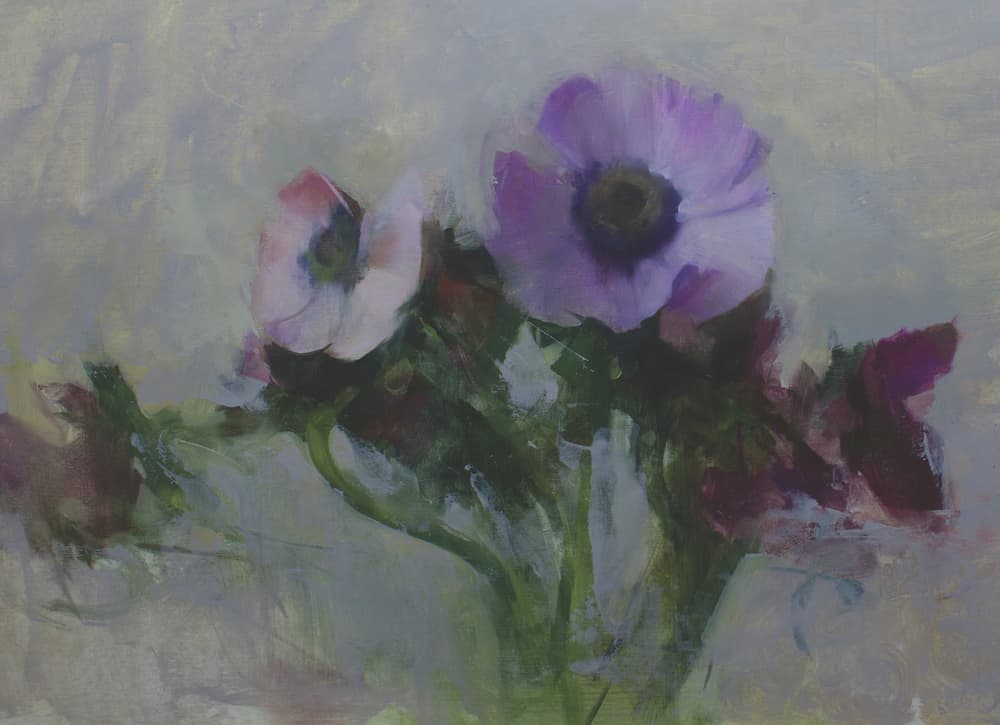
“I’m obsessed with roses,” admits Kathleen Speranza, the distinguished still life and floral painter who has been on a quest to translate the objects of her affection. “Roses have always been on the periphery of my work,” she says, explaining the genesis of her passion, “but I was reluctant to fully commit to them as a subject since they have more baggage than any other motif, with the exception of lighthouses and Velvet Elvis paintings. It seems they may have been waiting ‘in the wings’ for my full attention.”
The flowers eventually got her full attention by happenstance. It would take the gentle urging of a good friend who knew Speranza’s work well and saw something special developing in her roses. “She suggested that I commit to painting them in a serious way for one year,” recalls the artist, “and at the end of that time, evaluate what I’d learned.”
This article originally appeared in Artists Magazine. Subscribe now so you don’t miss any great art instruction, inspiration, and articles like this one.
Speranza took up the challenge, and in so doing, has created a masterful body of work. “Painting and teaching for more than 30 years, I’ve done every subject imaginable,” she says, “but there’s something happening in these particular works that’s really different.”
Different yes, and impactful. Along the way, generously sharing part of her journey on social media, the consummate teacher garnered a loyal audience eager to follow her progress. That led to an increased demand for workshops, both stateside and abroad. Her roster includes such destinations as Umbria, Italy; New York; Washington; and California, to name but a few.
I shadowed one of Speranza’s workshops, joining 14 devotees at the Florence Academy of Art, in New Jersey, America’s branch of the internationally respected schools in Florence, Italy, and Mölndal, Sweden. Located within Mana Contemporary, an impressive conglomerate of studio and exhibition spaces for the arts, FAA’s massive 10,000-square-foot Jersey City quarters are a replica of the original atelier in Florence. With cathedralesque ceilings and a huge corridor of tandem, north-lit studios lined with impressive artwork, the school is an amazing Zen-like environment for the study and appreciation of artistic exploration.
The Power of Neutral
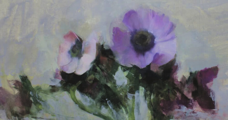
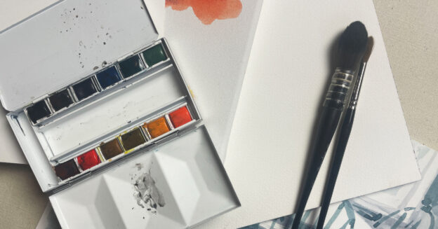
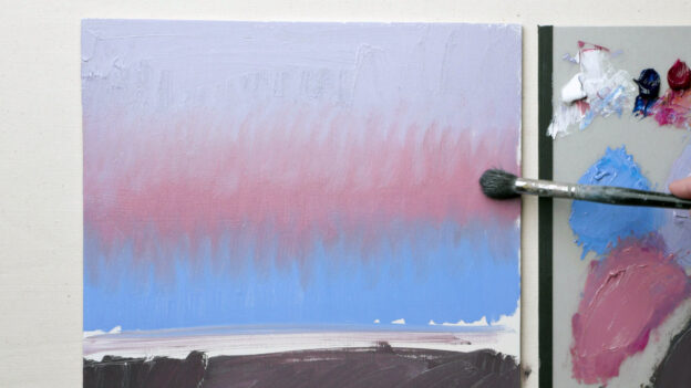
In this spectacular workshop setting, framed by a backdrop of her completed and unfinished paintings in various stages and buckets of fresh garden roses, Speranza introduced an indirect painting method and a limited palette. To that end, beginning with a neutral, she mixed a sizeable portion of ivory black with raw umber at a 3-1 ratio (a mixture affectionately called “blumber”). Adding flake white in increments, Speranza then premixed nine values from light to dark to match the Munsell color system’s gray scale. “The chroma in roses is very quiet,” she says. “By adding neutrals to color, you can get closer, right away, to what’s happening.”
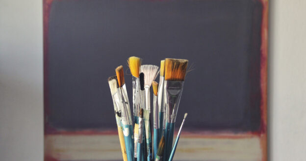
Addressing the remaining palette, Speranza added titanium white (cold, flat and opaque), flake white (slightly warm, translucent), terra rosa and Indian red (earthy reds), alizarin permanent (violet red), cadmium red, cadmium yellow, yellow ochre (warm toward orange), cadmium lemon (cool toward green), cobalt blue (cold toward green) and ultramarine blue (warm toward violet). “Color is a very specific tool in my work,” she says. “Keeping it ‘clean’ is key, as I constantly mix and introduce new colors. A glass palette makes it much easier.”
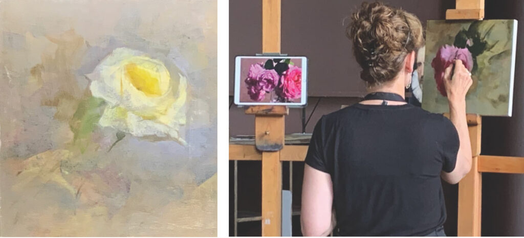
Speranza typically starts with reference drawings and sketches to get to know a subject. “I usually have three to 10 pieces going all at once,” she says. “They sit on the wall and talk to each other for at least a month.”
For the demo, Speranza set up a single rose. “Experience the subject,” she advised. “Observe it; question it; get close to it. We aren’t making ‘pictures.’ We’re having a relationship with our chosen subject. The viewer will see the result of that and feel what you felt in creating it.”
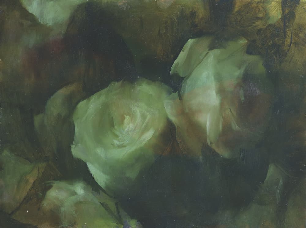
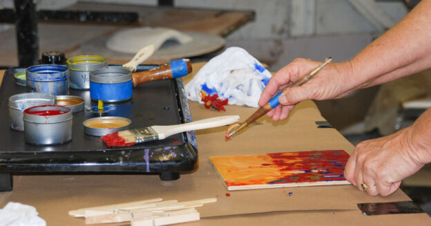
After a discussion concerning patterns of light and shapes, and working from the least important to the most important, Speranza mixed a greenish sepia color and, using only straight lines, began a simple drawing. From there, massing in shadow forms, she used Gamsol and paper towels to wipe out areas of light. “Don’t go too far with an underpainting or you won’t want to paint on top of it,” she cautioned. “Think placement, simplification—and remember—you don’t want interesting; you want powerful!”
Rounding out the day’s lessons, Speranza scrubbed in an ethereal background with the suggestion to keep the application airy, fluid and free. At this point, pumped and eager to follow suit, students chose their subjects and containers, set up individual compositions and began tackling their own line drawings.
Adding Color to the Mix
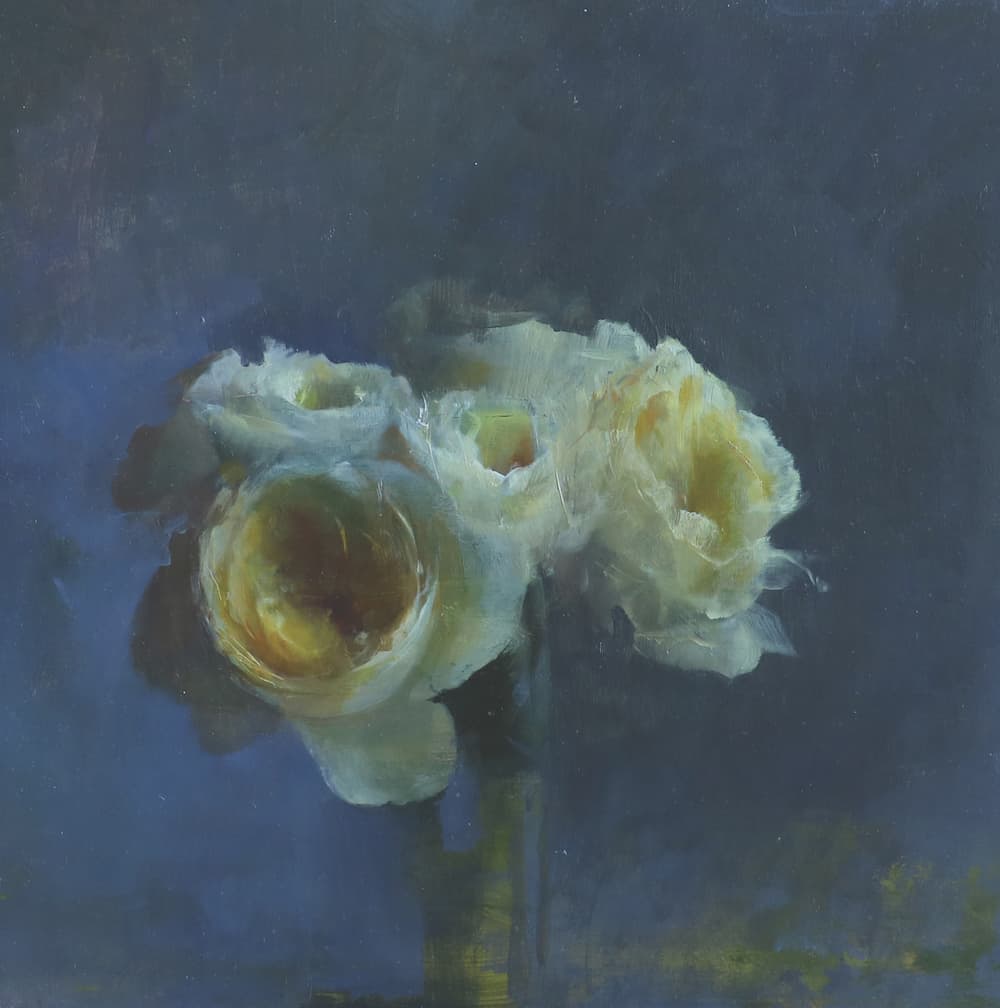
On day two, with Speranza at the easel readdressing her previous day’s work, a conversation ensued, encompassing Munsell, hue, value, chroma charts, and the advantages of a limited palette. The artist mixed light, dark and middle pools of paint to reflect the color subtlety of her subject. Establishing this triad as her working palette for that specific painting, and utilizing premixed neutrals to adjust value and temperature, Speranza shared a technique for matching an exact color by dappling paint directly onto a petal. “Roses are forms but also spaces created by layers of translucent petals,” she says. “Invoking their ‘presence,’ I’ve found that they become ‘portraits’ at the same time. In an attempt to become as sensitive as I can to their qualities, I believe they’ve deepened me as an artist.” Then, stressing mass over detail, she concluded the day’s presentation with a color block-in.
By all accounts, day three was a high point. Explaining how she brings her paintings to fruition in layers, the artist disclosed: “I work with subjects from life, but my process is not linear at all. The most important thing is the spirit of discovery and invention.” By way of “show and tell,” she generously described a series of steps, including drawing, painting, assessing, sanding back areas, and dreaming into space. “Probably the most bizarre thing I do is to turn a painting upside down or sideways if it’s not working,” Speranza confessed. “This will often spark a feeling of kinetic energy and gesture. I’ll then ‘graft’ another form into the space and continue.”
Demonstrating that process by working back into the original “ghost” of a yellow rose painting and substituting a pink one, Speranza played around with placement and then covered the dried canvas with a thin layer of cold-pressed linseed oil. Proceeding by mixing a middle tone, she commented, “All color happens in the middle. That’s where the complexity is. Hang out there long enough and then add deeper darks and lights.” In doing so, her painting was transformed. Despite being privy to only one stage of the color block-in, the class sat transfixed, witnessing Speranza create absolute magic.
Meet the Artist
Kathleen Speranza holds a BFA (magna cum laude) from Boston University and an MFA from Yale University School of Art. She has had a long academic career (1987–2019) teaching painting and drawing to all college levels at Montserrat College of Art, Beverly, Mass., and Rhode Island School of Design, Providence, R.I. Additionally, the artist runs painting workshops (still life and landscape subjects) throughout the U.S. and abroad. Speranza’s paintings have been exhibited in many public and private galleries in the U.S. and the U.K. Her work can also be found in numerous collections throughout the U.S. and abroad.
From Our Shop


Join the Conversation!