Grab and Go: Using Gouache for Plein Air
For ease of use and portability, gouache makes a perfect plein air sketching medium.
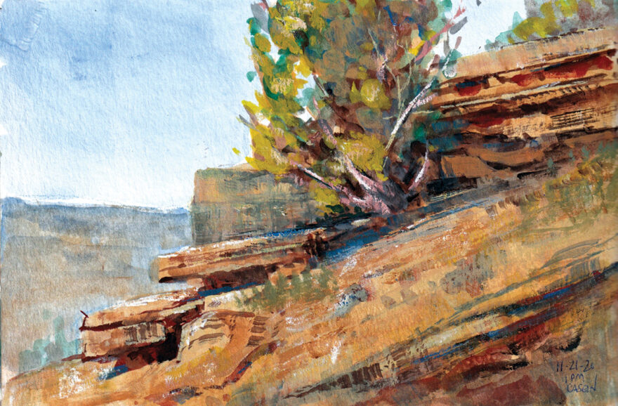
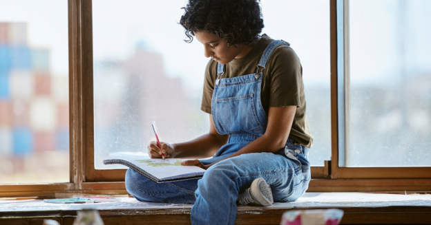
I’m a plein air artist who spends half the year in New Mexico. While hitting the trails for sketching excursions, I discovered a hidden canyon not far from my studio. The quiet and beauty has become a daily inspiration. Most times, it’s just me, the wind in the pines and a canyon wren or two. After an hour or so, I return from my canyon, relaxed, rejuvenated and at peace with the world.

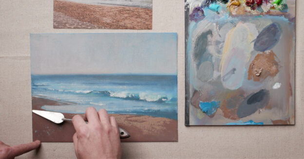
Because I hike along some rather steep cliffs, I keep my sketching kit light (see My Materials, opposite). Also, I want these outings to be more about “being in a place” rather than “messing with gear.” My kit centers around a 14-pan Caran d’Ache Studio Gouache set.
You may ask, Why gouache and not watercolor? I could use watercolor for these sketches, but the opacity of gouache is more suitable for my painting approach. As an oil and pastel artist, I’ve always been a fan of broken color and scumbling—two techniques I find more amenable to opaque gouache than to transparent watercolor. Gouache’s opacity also allows me to correct mistakes and eliminates the need to save the lights. Instead, I can punch in highlights toward the end. As the need arises, I can also use gouache transparently; when thinned enough, it produces stained-glass-like effects, similar to those of watercolor.


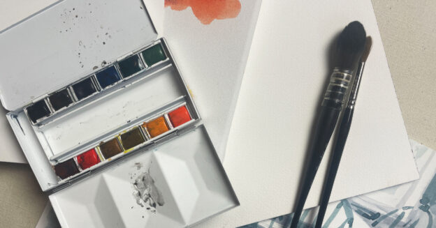
Gouache Set
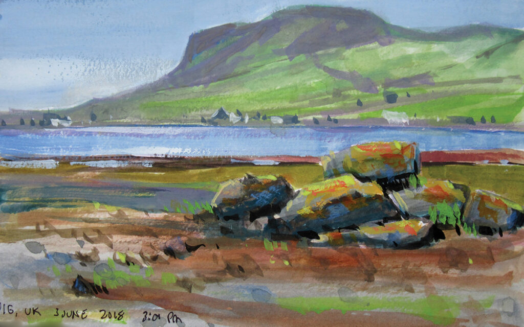
My Caran d’Ache gouache set includes some rather saturated colors. Since my canyon is mostly rock wall plus trees and bushes, I use mostly the earth colors with just a few of the others. The greens are a bit garish for my purposes, so I tone them down with a little brown. On the other hand, I’ve taken this kit to Scotland (see Stromness Wash and Uig, Scotland, page ••), and the variety of greens is exactly what I need there. Not all of the colors are lightfast, but this isn’t a problem for me because I use the gouache set only for sketching, and those sketches stay protected from light, closed within my sketchbook. I don’t intend to display them, but I may use them as references for studio paintings.
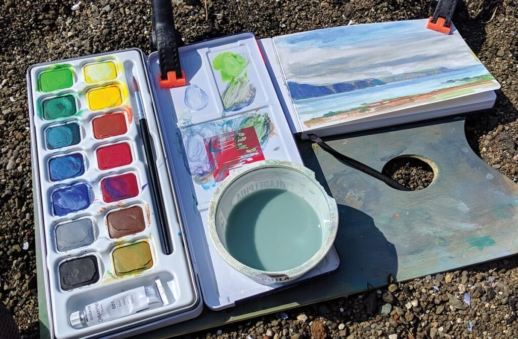
I prefer pan rather than tube colors for two reasons. First, the pans are more convenient because they come together in a metal tin with a lid that’s good for mixing small amounts of color. Tubes tend to get squashed in my pack. Second, using pan gouache saves me money. I waste tube paint because I squeeze out more than I need. Also, pan gouache is easier to re-wet, which extends the usability of the paint. Pan gouache can even reduce expenses on brushes because, in the arid Southwest, tube gouache quickly develops a skin that gets so thick, that puncturing it with a brush can damage the bristles. The Caran d’Ache set comes with a tube of white, but I put out just the tiniest amount—and only when I need it, typically for highlights.
My Materials
✓
PAINT: 14-pan Caran d’Ache Studio Gouache set, which includes pans of yellow, lemon yellow, vermilion, carmine lake, magenta, ultramarine blue, cyan, malachite green, yellow green, emerald green, ochre, brown, gray and black, plus a small tube of white
✓
SURFACE: 5×8 Pentalic Aqua Journal
✓
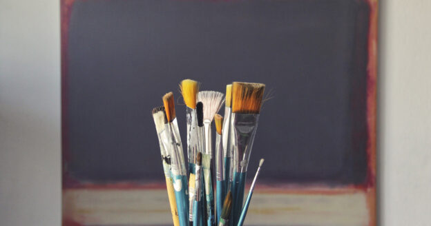
BRUSHES: Richeson Plein Air Travel Brush set, which has seven short-handled brushes: ¼-, 1½- and ¾-inch flats; Nos. 2, 4, 6 and 8 rounds
✓
OTHER: watercolor pencil; container for water and water bottle, a few paper towels, a sheet of plastic or other stiff material for a painting backboard (for working from my lap), clamps to hold everything together, egg-crate foam (optional back cushion)
Caran d’Ache Gouache Studio 15 Assorted Colors Set in Metal Tin

Pentalic 5″ x 8″ Aqua Journal, Watercolor

Jack Richeson Watermedia Pocket Plein Air Brush Set

Journal
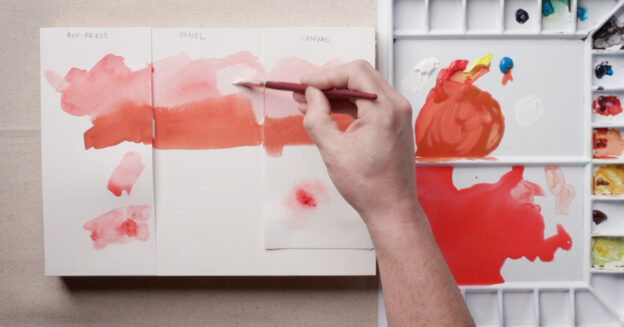
I scrub a lot when I paint, but the 140-lb. cold-pressed paper in the Pentalic sketchbook is durable and can take a beating. It buckles only slightly, even with a heavy wash. The pages are sewn into signatures and lie flat, so if I want to use two pages for a wider, 5×16 sketch, I can do so. Sometimes, when the weather is cool and damp—as in Scotland—and my sketch hasn’t quite dried, I’ll lay a paper towel over it and close the book, protecting both the new painting and the older painting on the opposite page. An elastic band on the journal not only keeps it closed with the paper towel in place but also prevents damage to the pages when I cram the journal into my pack.


Brushes and Pencils
The Caran d’Ache kit includes a small brush, but I tend to be rough on brushes, so I’ve found the Richeson brush set to be the perfect supplement. The flats and rounds have synthetic bristles that are quite durable. I also keep a small water-color pencil tucked into my brush set, which I use to draw a simple, light compositional sketch before I begin painting. I prefer this to graphite because the watercolor line will dis-solve somewhat and, if I’m lucky, enhance the final result (although I don’t mind lines showing through). An earth-color watercolor pencil works well if I’m painting a close-up of trees or rocks; a gray-blue is good if I’m including sky.
Although I’m a dedicated oil and pastel plein air painter, I find my gouache kit fits my sketching needs perfectly. Whether hiking locally or flying to Scotland, I’m happy to leave my other paints at home and pack my gouache kit instead.
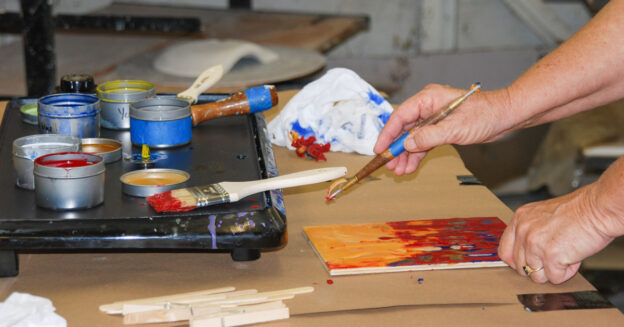
Demo: Juniper in Gouache
With my minimal painting kit, I’m always ready for a quick sketch.

Step 1
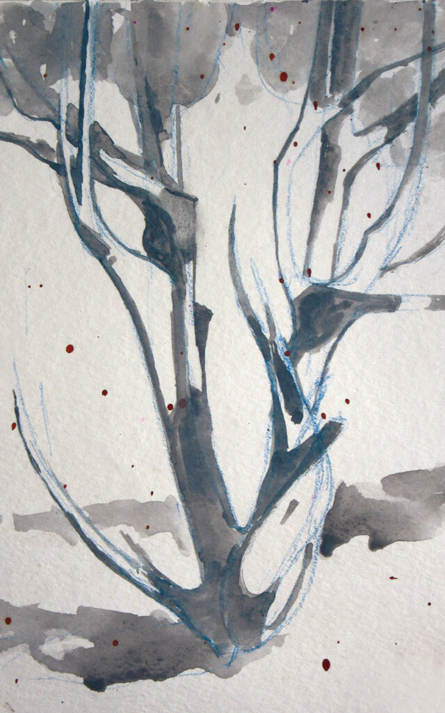
In my sketchbook, I first lightly drew the shape of the juniper with watercolor pencil. I chose a blue pencil because it would add a nice temperature contrast to the warm colors I planned to use when painting. The brown speckles are from an overly aggressive treatment of a sketch on the opposite page. I didn’t mind them because I knew they’d add interest to the final sketch.
Step 2
I like to block in tree shadows first because, in the canyon, the light seems to move especially fast. I used a gray wash for this.
Step 3
I started applying transparent color, thinning the gouache enough so it acted more like watercolor. I used a darker, thicker wash mixture of black and brown to draw the lines denoting form in the tree.
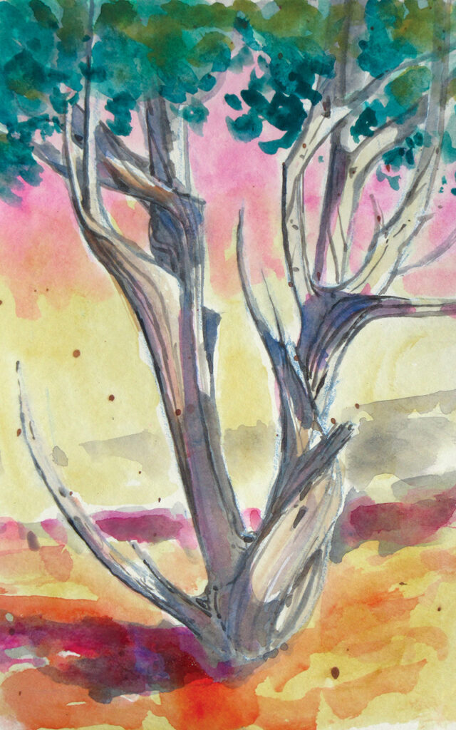
Step 4
Next, I began laying in areas of more opaque paint, especially in the foliage. Then I washed in some warm foreground colors—yellows, reds and browns. I added a touch of cooler red and magenta to the cast shadows.
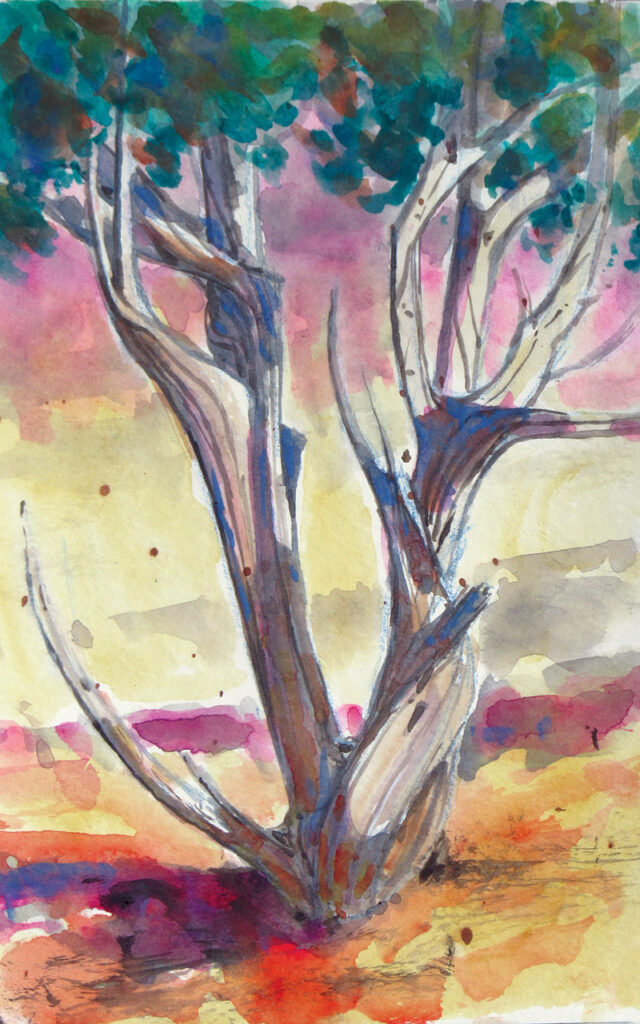
Step 5
Using the edge of my brush, I scrubbed dark notes into the shadow areas. The brush, which was fairly dry, left sharp-edged marks.

Step 6
In the final stage of Canyon Juniper (gouache, 8×5), I added texture to the bark, being careful to keep the brush fairly dry. Juniper bark can be quite light where sunlight hits it, so I used fully opaque white to add a few highlights. On the other hand, junipers often have shreds of warm, dark bark, especially in the shadows. To convey the feeling of that shredded bark, I filled my brush with opaque brown gouache and tapped it gently for a spatter pattern.
This article originally appeared in Watercolor Artist. Subscribe now so you don’t miss any great art instruction, inspiration, and articles like this one.
This article contains affiliate links that help us earn a small commission from purchases — at no additional cost to you. We are grateful for your support.
Michael Chesley Johnson Workshops
Pastelist Michael Chesley Johnson (mchesleyjohnson.com) is the author of Outdoor Study to Studio: Take Your Plein Air Painting to the Next Level and other books and is also a painting instructor who’s featured in several Artists Network TV videos (artistsnetwork.com/store). He teaches painting workshops throughout the United States.


Join the Conversation!