Playing the Odds
The rule of odds is one of the simplest—yet most dramatic—design principles you can apply to your composition and painting process.
by Carrie Waller
How can I make my art more impactful in order to better catch a viewer’s attention? It’s a question my students ask me more often than any other. I’m always thrilled to address this topic. There are many principles, or rules, of design that I cover in my art classes—and a basic understanding of those principles is essential to compositional success. I understand, however, that it can often be difficult to decide exactly which design rules to follow, when to follow them and when it’s OK to break them.
The rule of odds is one design principle I always try to follow. The rule suggests that a composition is more effective when it has an odd number of objects or elements. It can be applied to any form of art, from painting to photography, and to any subject, from landscape to still life.
Our brains naturally want to pair things up to create visual symmetry, so a work of art will be more visually interesting if the viewer’s eye travels around the composition looking for another object to complete the set. The rule of odds is one of the easiest ways to achieve that goal.


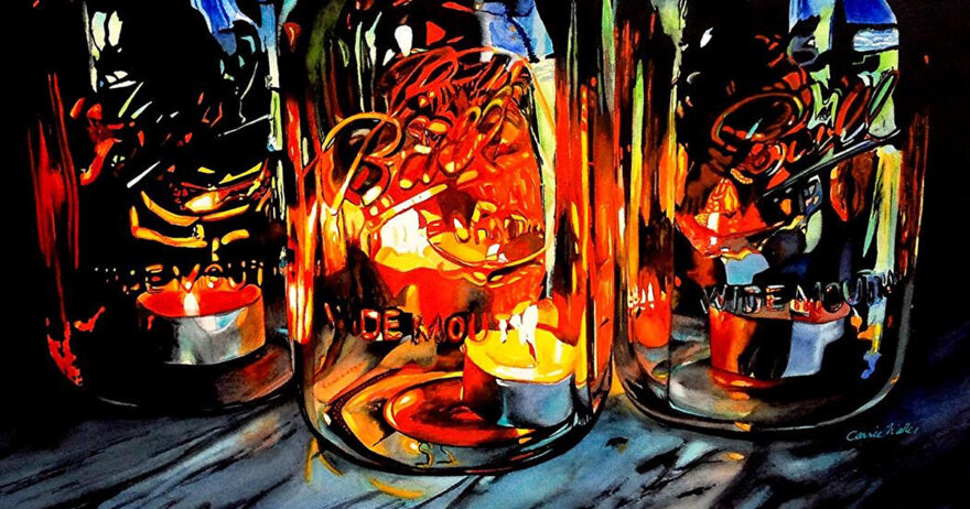
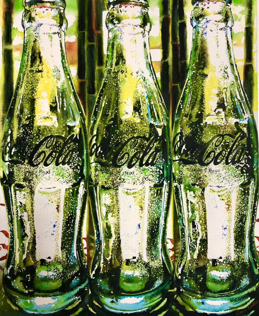
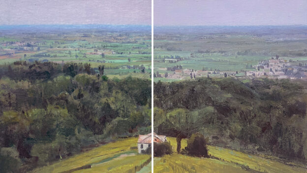
Compare Celebration (left) with Fire and Light (right). While both paintings are striking, the composition featuring a set of three jars is a more active and visually exciting design.

Demonstration: May Contain Pits
Follow along to see how I apply the principle of the rule of odds to a still-life painting.
Artists Toolkit
Surface: Arches 156-lb. cold-pressed watercolor paper
Daniel Smith Watercolors: Bismuth Vanadate yellow, Bordeaux, Payne’s blue-gray, quinacridone burnt orange, quinacridone purple, quinacridone magenta, quinacridone gold, pyrrol orange, pyrrol red, phthalo green (blue shade), sap green, opera pink, 50-50 indigo-sepia mixture (the darkest dark)
Brushes: 1-inch flat, Nos. 2 and 4 rounds, scrubber
Other: Holbein masking fluid, white, acid-free artist’s tape, paper towels, chambered water bucket, corrugated plastic board, ruling pen (or other masking applicator)

Step 1
All of my paintings begin with a photo shoot. I enjoy the planning and design stage almost as much as the actual painting stage. The design process is 95 percent complete before I ever put brush to paper. I use my phone to take reference shots, then view them in the photo grid in my phone’s photo library. They serve as at-a-glance thumbnail sketches, and I can quickly see if I captured any successful images. Once I decide on an image, I adapt it using my phone’s editing program and then import it into Photoshop to continue the editing process. I mark my favorite images with a heart to make them easier to find later, as you can see in a few of the images marked in the grid of photos above.

Step 2
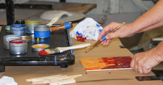
After choosing an image, I completed my drawing and transferred it to watercolor paper, which I taped to a corrugated plastic board. Since this is a 23×30-inch piece, I allowed the cherry jars to be a little larger than life. I started with the jar on the right, applying masking fluid thinly and lightly to protect my whites. I knew these white reflections would be crucial to making the jars look shiny and realistic. I began painting the cherries one at a time. As always, I was careful to make sure if I introduced a color—even as an underglaze—that I’d use it in at least three different places. I do this because as the initial washes are built upon, the beginning glazes will affect the color temperature of the whole painting. It also continues to implement the rule of odds.

Step 3
The cherries were backlit in the photo reference. To achieve the beautiful glowing color of the fruit, I built up thin glazes of reds, yellows, oranges and bright pinks. Each cherry required up to a dozen layers to get the values and level of saturation that I wanted. I’m happy with the glow I achieved in the end.

Step 4
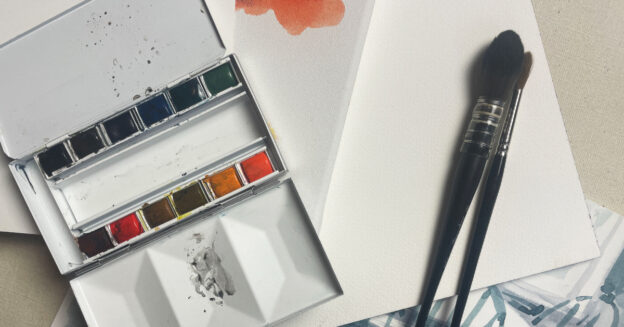
I completed one area at a time before moving on to the rest of the painting. This is a process I’ve adopted to help make sure my values are established and that I’ll have a successful end result. I made sure to include an odd number of cherry shapes within the jar to keep the viewer’s eye moving around the composition. The little containers pictured on the left are my watercolors. I make my own pans using these containers I found at a hardware store. I do all my color mixing right on the paper, which ensures bright and clean glazes.

Step 5
The second jar of cherries also contains an odd number of shapes. I added deeper values to direct the viewer’s eye to the center jar and these darker colors help make the yellow glow stand out even more. I subtly placed a teal color at the bottom of the center jar, because the addition of a complementary color always adds interest.

Final
To finish May Contain Pits (watercolor on paper, 23×30), I strategically placed the complementary teal color in five different areas at the bottom of the composition. Implementing the rule of odds in the early design stages contributed to the overall success of this painting.
About the Artist
Carrie Waller teaches workshops online and in person. She’s an ambassador for Daniel Smith Watercolors and holds Signature Membership in several prestigious watercolor organizations, including the National Watercolor Society and the American Watercolor Society. Her paintings have been exhibited all over the world and have garnered many awards—including Best of Show in the 2023 Women in Watercolor International Competition.
From Our Shop


Join the Conversation!