Complements of the Artist
Create visual impact and color harmony with a palette of Complementary Colors.
Complementary colors—the hues directly opposite each other on the color wheel— are eye candy. The eye delights in these color combinations and dances back forth with gleeful abandon along the edges where complementary colors meet.
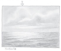
Try this experiment. Stare at the image of an apple (below) for a good 30 or 40 seconds. Really burn it into your brain. Then move your eyes and stare at the blank space beside the apple. An afterimage of a green or blue-green apple will appear. This happens because, as you stare at the apple, the rods and cones in your eyes become saturated by the red of the apple and begin to adjust. When you look away from the apple, the retinal impression persists, but the eye, having become less sensitive to the red light, sees more of the green or bluish green light in the afterimage.
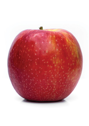
This is also why you may have noticed a green flash when the sun sets. As the sun dips low in the sky, it turns reddish orange before vanish-ing below the horizon. The and cones in your eyes become overloaded with the intense reds, which may cause you to see a gleam of green when the sun disappears. Human eyes are geared toward complementary colors, so they’re attracted to a painting that skillfully uses them to create color harmony.
Complementary Palettes
I learned about the power of complements from the book The Yin/Yang of Painting, by Hongnian Zhang and Lois Wooley, both of whom taught classes in New York. Their book describes a palette based on complementary hues plus warmer, cooler and neutralized versions of those colors. Zhang uses oil paints in the book, but Wooley’s work shows how easily the principles can be adapted to pastel.
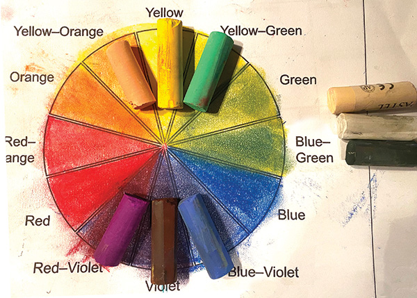
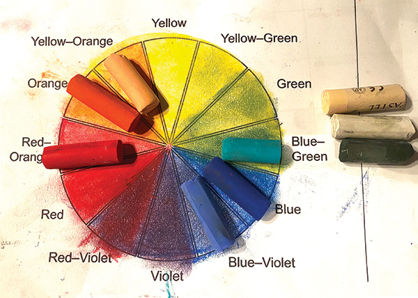
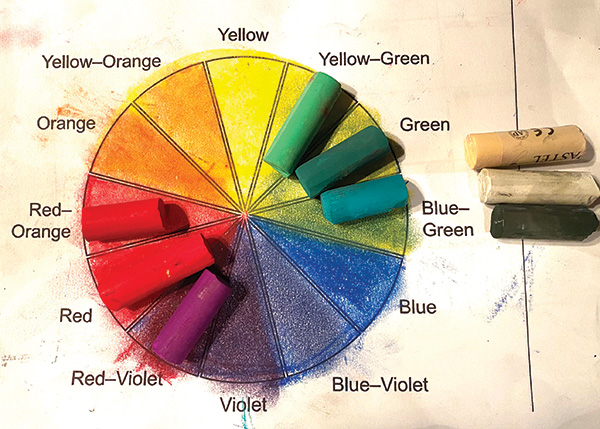
To create a complementary palette, start with two complementary colors. Then add a warmer and a cooler version of each of those colors. On the color wheel, these added colors are located on either side of your original complementary-color pairing.
For example, a yellow/purple palette would include the true primary yellow plus a warmer (yellow-orange) and cooler (yellow-green) version of yellow. I might also include yellow ochre and umber as yellows. On the purple side, I would use true violet, plus a warmer version (red-violet) and a cooler version (blue-violet). I could also use black and white to tint (lighten) and tone (darken) the colors. (See Yellow/Purple Complementary Palette)
“Even adding just a touch of complementary color into a painting will make it pop visually.”
Neutrals
You add neutrals to a complementary palette by combining complementary colors. For example, when you mix yellow with purple, you get mud—a neutral. All neutrals come from mixing complements, but if you vary the proportions of the complements, you get an assortment of neutrals that are much more interesting than any other color in your pastel box. What’s more, these neutrals tie the complements together, creating color harmony. (See Complementary Neutrals)
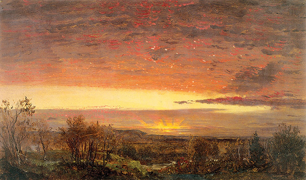
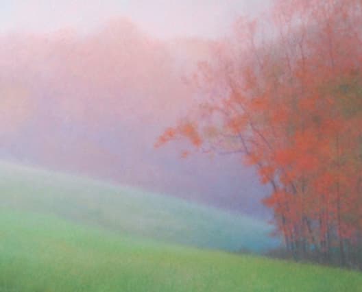
Neutrals also show off the high-chroma colors. If everything has the same color intensity, your eyes adjust, and color doesn’t stand out. Put a high-chroma color against a neutral, and it pops. Hudson River School artists were well known for taking advantage of this phenomenon, as evidenced by Sunrise, by Frederic Church.
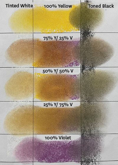
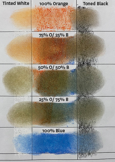
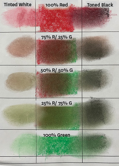
Complementary Neutrals
These three tables show the range of neutrals that can be created by adjusting the proportions of complementary colors. Toning with black or tinting with white further adds to the possibilities. Note the beautiful neutrals in each table. Once you learn to mix neutrals, you’ll never use a brown pastel again. What’s more, because the complements and their neutrals contain the same component colors, they all harmonize.
Chromatic Scale Yellow/Violet
Chromatic Scale Orange/Blue
Chromatic Scale Red/Green
Selecting Complements
I’ll often do studies using different complementary palettes to decide which palette works best for a final composition. These studies are all made using only the complements plus warmer and cooler versions. The complements are often layered or blended to create the neutrals, resulting in color harmony.
To make a color study, start with a value sketch or a black-and-white reference photo. This keeps you from being overly influenced by the natural color of the scene. Next, use a color wheel to help you select pastels. Choose two complements and add warmer and cooler versions of each. Once you’ve selected the six pastels, create a color study. Add black and white to tone and tint the colors, as needed, but don’t add other colors.
Repeat this process, starting with a different pair of complementary colors. After creating two or three studies, select the color palette you prefer for your painting. (See Choose Your Complements)
Choose Your Complements
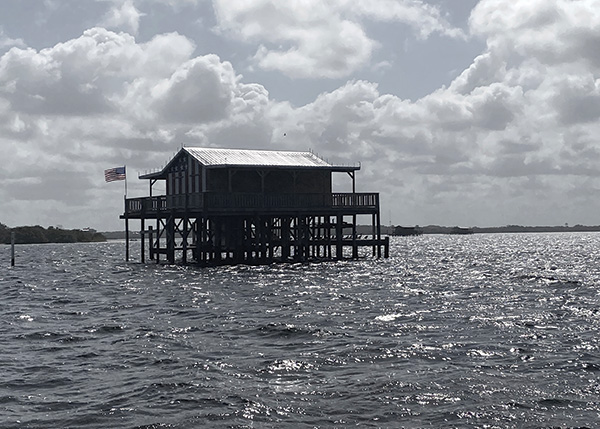
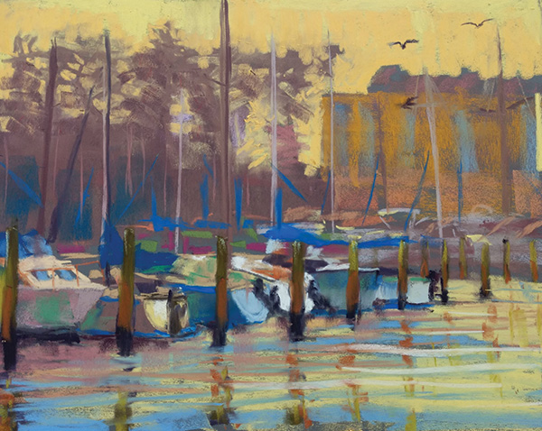
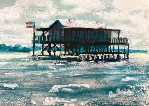
I created three color studies to determine the best palette for a painting of a Gulf Coast stilt house. I based the studies on a black-and-white photo, which served as a reference for the composition and values without influencing my color choices. Which palette would you choose?
Yellow/Purple Complementary Palette and Corresponding Color Study
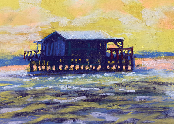

Orange/Blue Complementary Palette and Corresponding Color Study
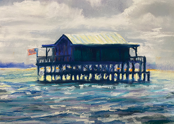
Red/Green Complementary Palette and Corresponding Color Study
“Human eyes are geared toward complementary colors and are attracted to any painting that skillfully uses them to create color harmony.”
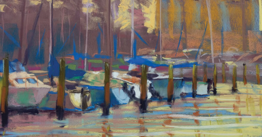
The Payoff
Many novice pastelists make the mistake of using every color in the box on a single painting or of failing to build up color by layering and neutralizing. The more you study color theory and integrate it into your art practice, the more appealing your paintings become. Even adding just a touch of complementary color into a painting will make it pop visually. What’s more, building neutrals from your complements creates color harmony—and color harmony creates a calming and soothing effect in viewers, as does using a combination of neutrals and high-chroma colors.
If you use color wisely, your viewers will be drawn to your paintings without knowing why. You’ll hear comments like, “There’s something about this painting that I just love!”
Meet the Artist: Shawn Dell Joyce
Shawn Dell Joyce (shawndelljoyce.com) is a Florida-based plein air teacher and the founder of the WallKill River School of Art, in New York. Her work has been featured in several publications and is represented in galleries across the United States.

I see that the palettes are complimentary and understand that there is a black and a white along the side to tint and tone, but what is the extra yellow pastel above the white used for?