Pastel Demo | Tale of Two Surfaces
[Featured in the Fall issue of Pastel Journal] Painting the same subject on two entirely different papers reveals fresh creative possibilities. – By Liz Haywood-Sullivan
Highly awarded pastelist Liz Haywood-Sullivan (lizhaywoodsullivan.com) served as the president of the International Association of Pastel Societies from 2013 to 2017. She appears in 12 Artist Network videos and teaches workshops worldwide.
Exploring the capabilities of your medium and pushing beyond your normal boundaries is good art practice. Not only does it keep your work from getting stale, but it can open doors to new forms of expression.
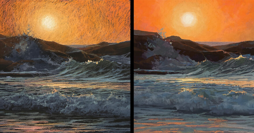
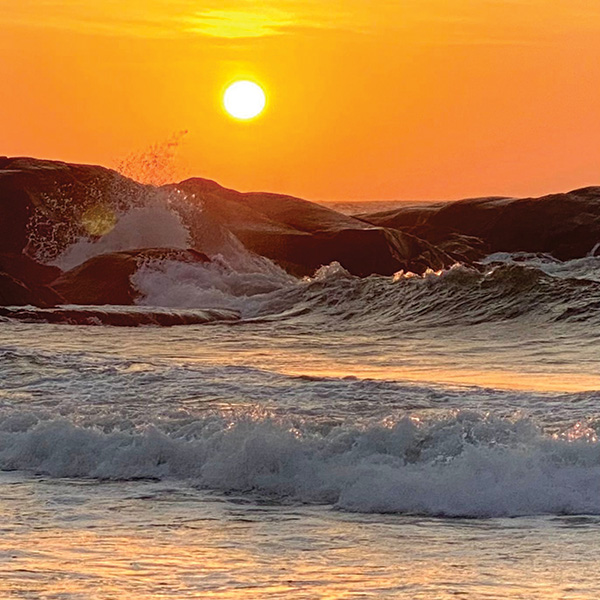
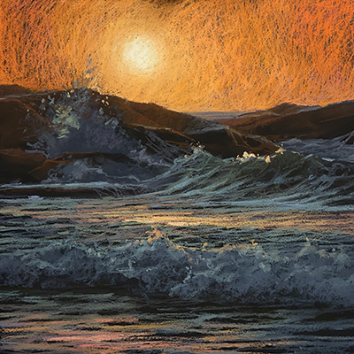
I like to challenge myself by changing my painting surfaces, moving back and forth between sanded paper and non-sanded paper, often changing the base color as well. This keeps me on my toes and open to new directions. Recently, I decided to investigate how working on two very different surfaces in two opposite colors would affect the look and feel of an identical subject. For my reference, I chose a dramatic image of crashing waves during an offshore storm at sunrise on a Rhode Island beach. Then I painted Red Sky 1 on white sanded paper and Red Sky 2 on smooth black paper.
Comparing Notes
Each of the two surfaces offered benefits to the paintings. Working on white allowed me to achieve a high level of brilliance in the sky. Also, the sanded white surface held far more layers than the smooth black one. This allowed for smooth mark-making on the lighter surface and enabled me to create a textural difference between the quiet sky and the crashing waves.
One generally employs a pastel underpainting only when working on a light-toned, sanded surface. In the case of Red Sky 1, that underpainting was critical. I used it to create the color beneath the waves, so that all I needed to do to complete them was to draw the dancing light on top of the water.
I also used the underpainting to create the dark rocks, which provide the underlying framework across which the waves moved. Locking in those first layers of darker colors allowed for clean stokes of lighter pastel on top.
Working on the smooth black surface led me in other directions. Black pushed me to use stronger pigments and brighter colors, which encouraged experimentation. Because one generally doesn’t create an underpainting on dark paper, and because it’s hard to fully cover such a surface, the color of the paper tends to peek through; however, I turned those limitations into strengths. The black popping through provided interest and drama and encouraged dramatic mark-making. Working on black paper is a great choice for moody pieces such as those depicting snowstorms or rainy days.
The Dark side
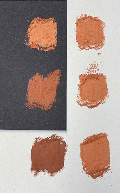
When working on a dark surface, you need to use more intense colors. In the image below, the colors in row one are the same, but the swatch on dark paper looks lighter. In the second row, I substituted a different color on the dark paper—one that visually matches the swatch on the white paper. For the third row, I used the same colors as I did for the second row, but when placed on white paper, the color on the right looks much darker and more intense. This is an example of the law of simultaneous contrast, which states that the perception of colors is influenced by the colors around them.
I love the fact that working on black makes me use pastels not generally present in my palette. I find myself selecting more strongly pigmented colors that are one or two values darker than my typical choices.
Pastel Demonstrations
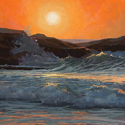
Red Sky 1
Surface: Lux Archival sanded paper (creamy white) mounted to 20×20 white Gator Board.
Step 1: I began by selecting and laying down colors for an underpainting. The most important thing at this point was to choose pastels that would match the values of the finished painting; color was of secondary importance. I chose the somewhat monochromatic hues of grayed purple and blue. These colors provided an underlying base that would complement the predominant oranges in the final painting. I prefer softer pastels for an underpainting, in this case Terry Ludwigs and Diane Townsends, because they wash down easier than harder pastels.
Step 2: Using large strokes, I applied 72-percent rubbing alcohol with a soft, flat synthetic brush, washing down all of the dry pastel. Once the surface dried, I stepped back to evaluate my work. Many of the most important aspects of a successful painting—composition, values, focal point—can be established during this phase. What’s more, these aspects can easily be modified at this point.
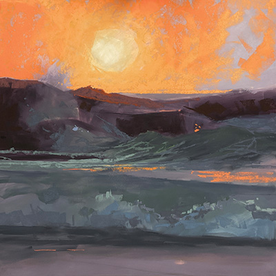
Step 3: I was ready to add the initial layers of color. First, I established my lightest light and darkest dark. I like to lock the darks into the underpainting so that they won’t muddy the painting by mixing with the lights on top. Then I selected my working palette of local colors for all areas of the painting. If you get your values right in the underpainting, you only need to adjust the hue with a light layer of local color.
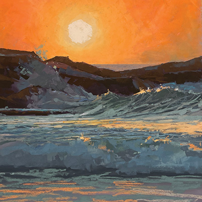
Step 4: I brought all areas of the painting to completion simultaneously. Keeping the texture of the sky smooth made it appear to recede and kept it from competing with the tumultuous surf in the mid- and foreground. When the painting was nearly complete, I checked the details. Were the highlights in the right spots? Were they too distracting? I made final adjustments to the rock shapes and the sunlight glancing across them, thus completing Red Sky 1 (pastel on sanded paper, 20×20).
Final Thoughts
Of the two paintings, Red Sky 1 more accurately depicts my feelings while on the beach. The sky was quiet and a brilliant orange as the sun came up. At the same time, an offshore storm was kicking up the most amazing pounding surf. The contrast between the warm, sunlit day and the cool, shad-owed night was gorgeous.
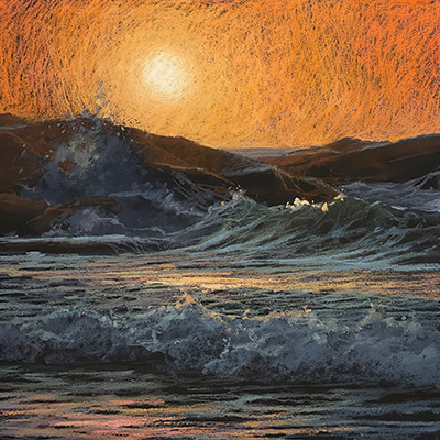
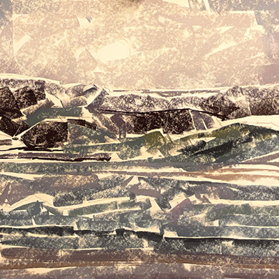
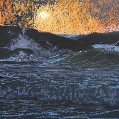
Red Sky 2
Surface: Canson Mi-Tientes paper (black) smooth side up, mounted to 20×20 Gator Board
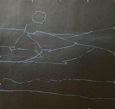
Step 1: Before beginning this painting, I created a thumbnail sketch, breaking the image in the reference photo into value shapes. I then transferred these simple shapes to my painting surface. This is how I start every painting, but with a dark surface I had to be careful not to make these marks too strong—in case I wanted to move them.
Step 2: An unsanded surface has minimal tooth and can take only a few layers of pastel before filling in. For this reason, I used a light hand to develop each layer of pastel. With this first pass of color, I established larger areas with no tight or specific details. I like to complete this layer over the entire painting before developing or finishing any single area.
Step 3: When working on smooth paper, I use the tip of my pastel to get the pigment deeper into the tooth. This means that my mark-making is more obvious than it would be on a sanded surface, for which I use the side of my pastel and larger strokes. For this painting, I built up the brilliance in the sky by laying down multiple marks, slowly building to the level of light and tone I desired. I wanted the black paper to act as the dark areas of the water, so I was careful not to cover the black completely. I started with darker pastels and layered lighter and lighter pastels on top to indicate the reflections on the water and movements of the waves.
Step 4: Work on unsanded paper is slower and more deliberate because it has minimal tooth, so the pastel isn’t as easy to erase or rework. The process involved is a gradual building up of multiple layers to bring the light and color to the desired finish. Details tend to be more drawn in than they would be on sanded paper. Consequently, Red Sky 2 (pastel on smooth paper, 20×20) didn’t “sing” or come to completion until the final highlight strokes—the sunlit tips of the waves, the orange light reflecting in the flat troughs and the edge lighting on the back-ground rocks.
Final Thoughts
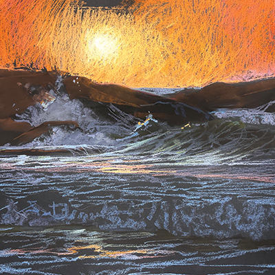
My favorite comment about the Red Sky paintings came from a friend who said that when she looked at the dark-paper version, she could hear the sound of the pounding surf. The directional mark-making in this piece pro-vides tremendous energy and movement. That effect was totally unanticipated when I began the work and only set in as I let the painting take me where it wanted to go. This kind of discovery was the entire purpose of the experiment.

Have a technical question?
Contact UsJoin the Conversation!